Check out recent projects by RGD Members.
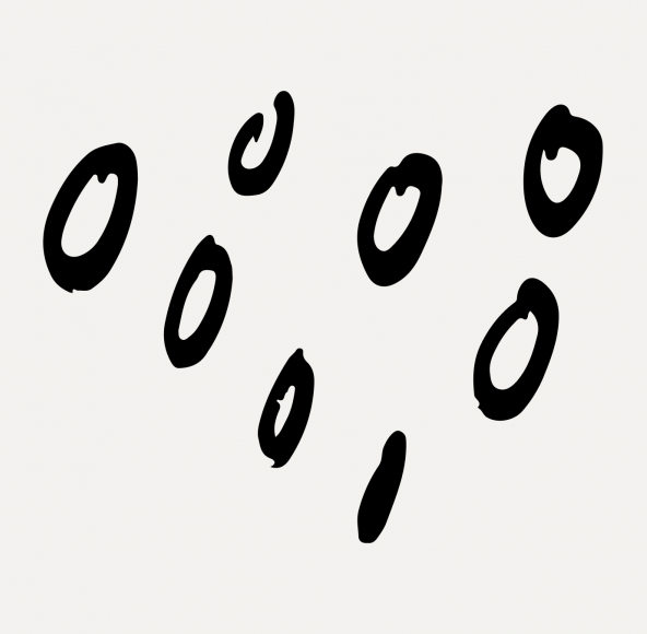
Derwyn Goodall RGD worked with Graham Roumieu and Flash Reproductions to create a humorous promo on the benefits of doing good work for new and existing clients.
Large typography and strong, evocative visuals were selected to cut through the daily sea of digital clutter. Illustrations of seven visual messages showcase different aspects of the design concept. The promo was printed by the experts at Flash Reproductions, using only Pantone Black and Pantone metallic Gold. An elaborate dye cut enables the 8-panel brochure to physically fold out to a poster. It is accompanied by a 9”x12” envelope. A handwritten letter is contained inside and the envelope features a handwritten destination on the front.
Alison Garnet RGD and Carolina Soderholm of Field Trip & Co designed the self-promotional mailer for JK Reps, a Toronto photography agency representing an art-based group of photographers.
The non-linear layout approach mixes photographers and speaks to JK’s finely honed skill of curation, while allowing each image to convey a feeling. The photography promo was printed with UV inks to showcase the images in the best way possible. The layouts were designed with one fluorescent pms special. Usually the drying of fluorescent UV inks under the pressure of quantities of paper in a stack can cause the heat to change the colour. Our brave printer decided to experiment and try it anyway, and since this project was a smaller quantity (500 brochures), the heat of a paper stack did not cause the fluorescent ink to shift. Both the UV and neon inks work in harmony to make the images perform at their best as well as a beautiful punchy fluorescent to make the design glow.
Michael Barker RGD (Acme Art & Design) designed the 5th edition of Re:New magazine, the alumni and friends magazine of New College at the University of Toronto.
This issue (the "Who K(NEW)?" edition) offers a behind-the-scenes look at the people and everyday operations that keep the college running and explores themes of community, equity and food. In addition to art direction and design, Acme did the feature photography, including a reportage-style profile of the college's cafeteria kitchen, environmental portraits of maintenance staff and editorial food photography. This is the second issue Acme has produced with New College after redesigning the publication last year.
Melissa Deschenes RGD and the team at Design de Plume worked with The Native Women’s Association of Canada (NWAC) to create the unique branding and collateral materials for the 2017 Indigenous Women’s Leadership Conference.
Indigenous women have overcome multiple intersecting barriers on their paths to success and gone on to become leaders, role models, advocates and catalysts for change. The event focused on cultural exchange and celebration of Indigenous women’s social and economic empowerment. The hawk in the logo signifies perseverance, deliberation and foresight. For the Anishinaabe, the hawk (Kaikaik) and the sparrow hawk (Peepeegizaence) are both part of the Leadership totem. The bird taking flight symbolizes a woman achieving success and as she spreads her wings she becomes accomplished, motivated and achieves career take-off!
Breck Campbell RGD created a showcase poster to help The Marrieds stand out at the Folk Music Ontario Conference.
The Marrieds’ FMO Conference showcase poster needed to be simple enough to have a significant visual impact from a distance to stand out amongst 200 other acts, and also had to include accolades, press quotes, dates, times, locations, and contact information. Establishing content hierarchy early helped us address this challenge. The concept of interlocking wedding bands created a functional framework for the poster. The supporting content was edited to groupings of three and adding logos provided visual anchors for each. Lyrics set in a ribbon-like script separate the colour fields and the background, providing a lovely typographic pay-off for those who investigated at closer range.
Nicola Hamilton RGD and Vanessa Wyse at Studio Wyse developed a new identity for photographer May Truong.
May Truong is a Toronto-based fashion photographer. Her work melds together strength and femininity and often nods to her Asian heritage. May really wanted something that represented her and the kind of photographer she is — small but tough, constantly making connections, an epic cheerleader and a pro at capturing her subjects' idiosyncrasies. In response, Studio Wyse made her a promo package made up of differently sized postcards layered on top of one another to invoke the idea of a magazine. Each one is emblazoned with May's name, set in Futura. Every single package is different, carefully curated by May herself, so she could connect seemingly unconnected work for surprising results. There's a limited edition of 50, hand-numbered by May and delivered with a sweet little compliment, like "you're more fun than bubble wrap." See more of this project.