RGD | The Hub for Graphic Design
Spotlight
Trending


Fidel Pena-Guzman RGD, Liz Wurzinger RGD, Sebastian Abboud RGD, Catherine Charbonneau RGD


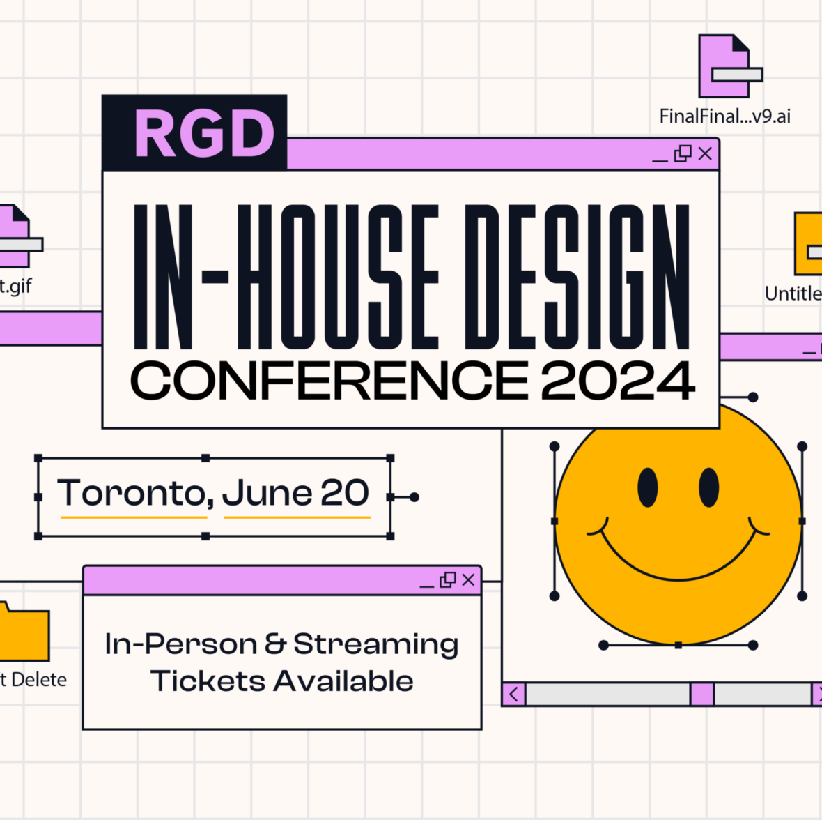
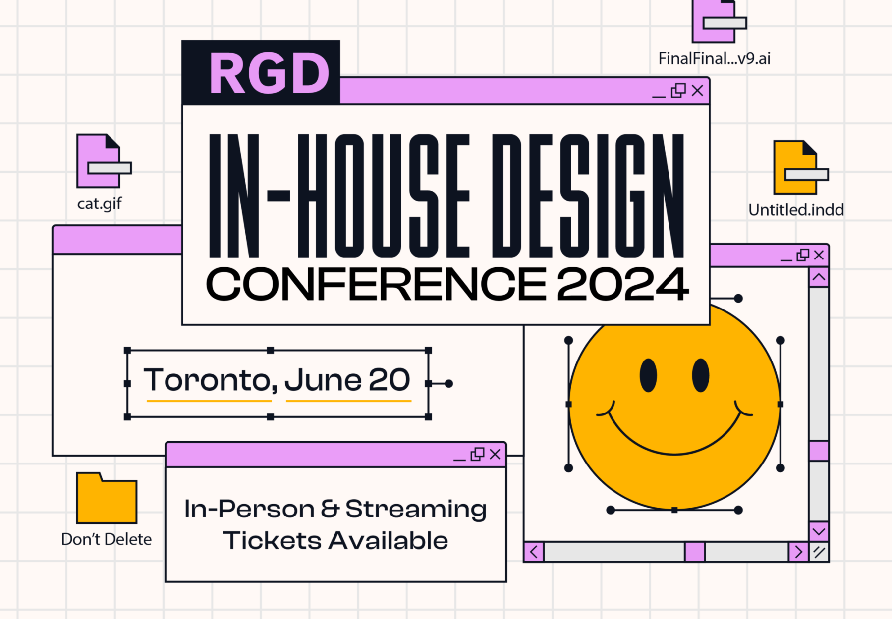
Art With Heart is a charitable auction and a prestigious celebration of contemporary Canadian art. The evening features a live and silent auction of prints, paintings, drawings, textile and sculptural work by some of the country’s foremost ...
Latest
Donna Darby, Michel Viau, Bob Hambly
Bianca Jozwiak RGD
John deWolf RGD

Art With Heart is a charitable auction and a prestigious celebration of contemporary Canadian art. The evening features a live and silent auction of prints, paintings, drawings, textile and sculptural work by some of the country’s foremost ...

Fidel Pena-Guzman RGD, Liz Wurzinger RGD, Sebastian Abboud RGD, Catherine Charbonneau RGD

